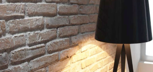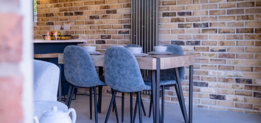
On average, we decorate our homes once every 8 to 10 years so if you are deciding to use Brick Slips then you need to make sure that the colour is right for you.
Mood Boards are Great
One of our first pieces of advice would be to start putting together two or three different mood boards. These boards help showcase your colour and texture options.
This method is especially good when looking at brick slips as this allows you to compare different looks and make an informed decision.
Deciding on Colours
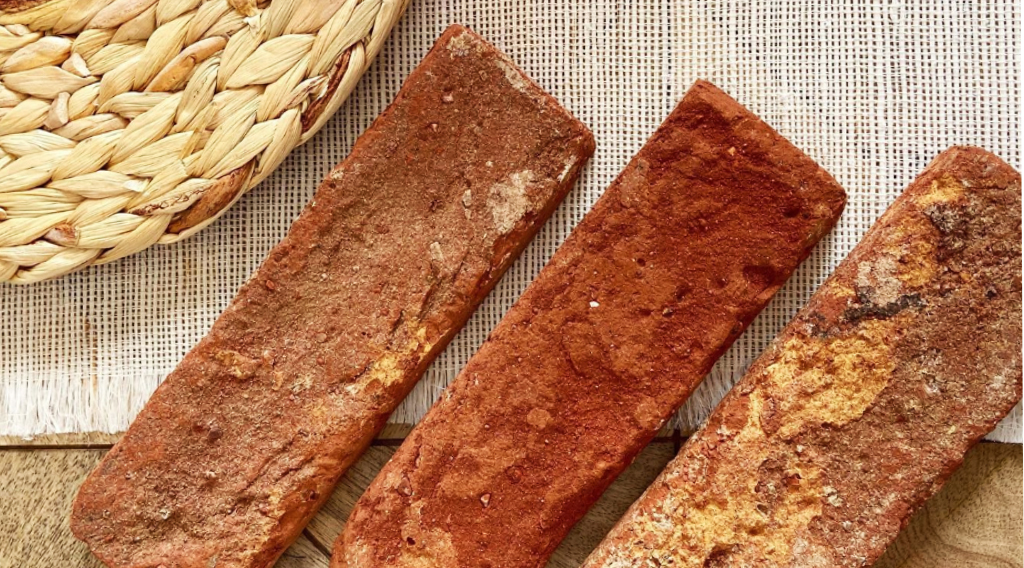
Taking a measured and systematic approach to building colour palettes is always the best way. Brick slips are a dominating and prominent feature so the colour is vital in achieving the desired look you are wanting.
Starting with the room it always helps to have an idea of how the space will be used, how it will be furnished and if there are any existing furnishings that need to be considered. This will give you a better idea of brick and texture.
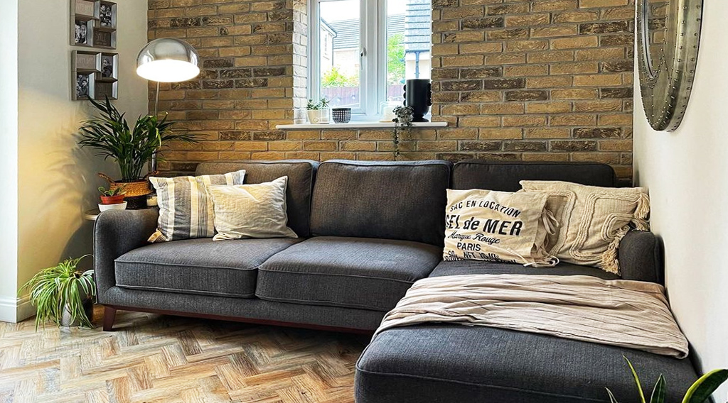
If possible I’ll gather samples of existing finishes.
This helps to understand the colours and textures that the colour scheme needs to complement.
The base scheme should always be dictated by the accent colours: if you are using warm accent colours then its best pair these with a warm neutral base palette.
The impact of using brick slips can intensify when applied to multiple surfaces, so choose your feature wall or bricked area prior to starting the project. Sometimes less is more.
Where to Apply Brick Slips
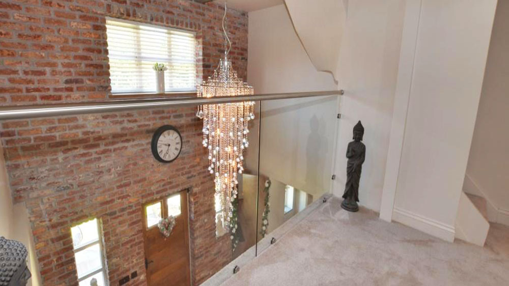
Where you apply brick slips will influence the effect it has on a room.
For example, using a red clay slip in a concentrated area will draw your eye and create a focal point.
Therefore it is important to consider the most appropriate area and application.
Brick Slip Colour Trends
The most striking trends are often seen in commercial application, we have all been seduced by the use of a bold colour or finish in a hotel bedroom or restaurant, transitional spaces where we spend limited time.
Always consider how you might feel about strong colour statements if you have to live with them permanently.
Interior designers often make the boldest colour recommendations in the transitional spaces of the home such as the entrance hall or cloakroom.
Commercial Brick Slip Colour
When working with commercial interiors, brick colour can be used to reinforce brand, business ethos and corporate values.
A calm and sophisticated palette of neutral colours might work really well in a hotel lobby or reception, but a contemporary inner-city advertising agency is more likely to request a punchier proposal to reflect their brand and creativity to potential clientele.

Your Choice
At the end of the day, the Brick Slip Colour you choose is your choice. We are here to guide and inform.
Take a look at our Gallery for more inspiration on Brick Slip Colour.


